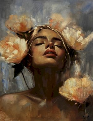


Variety in art refers to the use of the seven visual art elements used to create interest, complexity and contrast in the artwork. It is a design principle that allows artists to add depth, complexity, and dimension to their compositions, enhancing the viewer’s visual experience.
The principles of art variety build interest by playing with the placement of information, reducing repetition, allowing a variety of textures, using both hard and soft edges that do not feel repetitive, and adding complementary or accent colours and shapes that bring movement and rhythm to the design.
At the same time, the artist ensures variety without going overboard, until you achieve the perfect harmony or unity in art. The three main types of the principles of art variety are contrast variety, gradation variety, and alternation variety.
Variety in Art: Definition, Importance, Examples & How to Use It Effectively
Variety in art is a technique in which artists use different elements, such as alternating the scale or size of objects, varying brushstrokes, changing colour values, combining geometric and organic shapes, and using contrasting colours, while balancing unity and variety.
A famous example of variety is Vincent van Gogh's The Starry Night, which uses varied brushwork and colours to create movement.
What is Variety in Art?
Variety in Art is created by using different visual elements, such as colour, line, shape, form, value, and space, to keep viewers engaged, prevent monotony, and emphasise specific elements.
Importance of Variety in Art
The principles of art variety break boredom and add interest and distinctiveness to the work. It is implemented through contrast, allowing one to tweak details to add variance to otherwise repetitive artwork.
It helps a designer guide the reader down the page and reinforces a visual theme that highlights information.
It helps focus on specific parts of a compilation and communicate a specific message to viewers. Artists use the difference between elements to control where viewers look first, second, and next. The area that pulls viewers' attention is the one with the most variety or contrast.
Elements That Create Variety in Art
Contrast- Contrast can be used to add variety in a piece of art. Contrasting elements of design, such as light and dark colours, smooth and rough textures, and thick and thin lines, create depth and movement. Contrast adds dynamism and makes an artwork look more engaging to the viewer.
Create a focal point: the area that draws the viewer’s attention.
Colour - Colour is the simplest way to add variety, as one can use different colours, shades, tones, and tints, and combine them in vivid ways to create diverse compositions. If a painting is in cool blue and green and warm red in one section, the red area becomes the focal point.
Warm colours such as red contrast with blues, and both warm and cool colours stand out against each other. Colour schemes, such as complementary colour schemes, sit on opposite ends of the colour wheel, and dissimilar complementary colours, such as purple and yellow, create contrast and variety in painting. Sometimes saturated and muted colours are added to create balance.
Line - Line variance can be used to adjust line parameters and observe how the work's tone and look change. Lines can be short, thick or thin, broken or continuous, curved or straight. A contrast can be created using vertical, horizontal, or diagonal lines formed by the edges of the path, grassy land, river, tree canopy, and floor.
Repetition and pattern - Repetition and variety conflict, but the two principles allow the work to depict a harmonious, interesting design theme.
Emphasis - Emphasis calls attention to the important message conveyed by a compilation; it makes things appear larger or more significant.
Movement - Movement conveys the flow of information and helps readers scan the page.
Texture variance - Changes in surface quality create variations in texture.
Value variance - Value variance is achieved through light and dark tones, which can also create drama and draw the viewers' focus to a specific section.
Medium - Artists add variety by using different media or colour types; for instance, they can use oil paint in one area and watercolour in another to create a contrast and make the painting visually interesting. Another way one can add variety is to combine different media in one artwork.
For instance, one can use charcoal to create a rough sketch and add colour with pastel to create texture and depth to it, or they can use composition to change and add variety, where the artist changes the placement of objects or the angle of the composition to create a new perspective and make the work appear dynamic.
Scale -One way to change composition is to alter the scale of objects by adding a large object in the foreground and a smaller one in the background to create a sense of depth.
Types of Variety in Art
There are three types of methods used to add variety to a composition.
- Contrast variety uses contrasting elements, such as dark and light colours, textures, and large and small shapes, to generate drama. Contrast can create variation, making the artwork look more dynamic and eye-catching.
- Gradation variety can be achieved by changing the element value from one to another, shifting from light to dark, or from small to large. Hue, size, or position can be changed to draw the viewer’s attention to something interesting, creating subtle variety while keeping the work unified. Gradation creates a sense of movement, resulting in a smooth, flowing transition.
- Alternation variety establishes rhythm and generates interest by alternating different elements randomly or predictably. Examples of alteration include creating a sequence.
- Elaboration adds extra details and complexity to the work.
Examples of Variety in Art (With Explanation)
Some common examples of the principles of art variety are given here.
Contrasting colours (reds with blues), mixed textures, varying line weights, shapes, sizes, directions, and changes in value can add variety.
For instance, a landscape painting that demonstrates the variety principle features tall, vertical trees contrasting with horizontal ground planes; smooth water against rocky textures; bright, warm sunlight against cool shadows; or large mountains in the background with small flowers in the foreground.
- Baroque art is known for variety. It uses light and shadow, and figures twist through space as fabric or metal changes or folds in unpredictable directions, making the art appear alive and even theatrical.
- Minimalist art deliberately uses variety to ensure viewers pay attention to the work.
- Abstract expressionism uses variety to display emotions.
- Post-impressionist artist Vincent van Gogh added variety in his artworks with colours, flowing and jagged lines, textures, and the juxtaposition of elements, creating interest. He used various colour schemes, simplified shapes and details and knew how to make diverse elements look unified. He used complementary colours red and green in the grass to add variety.
- Andy Warhol used the same face and the same product to create prints with different colour combinations, such as the Marilyn Diptych.
- Roy Lichtenstein used comic strips and advertising to add variety through source material and scale.
- A sculptor creates works that change in real time, adding variety.
- Architects add material contrast and spatial sequence to add variety.
Unity and Variety in art
Unity gives a sense of connectivity and synchronicity, and variety creates difference. Variety establishes contrast and guides the viewer’s eye through the composition, creating a sense of balance and harmony.
Variety enhances visual interest and also conveys meaning and emotion. For instance, the use of warm colours in an artwork conveys a sense of warmth and comfort, while multiple cool colours convey calm and serenity.
Unity and variety in art combine the chaos and harmony to create a successful composition. Unity in art provides harmony through consistent colour schemes, similar texture and repeated shapes, but can become boring without variety. Variety prevents monotony, but too much looks chaotic.
Unity And Variety in Art Examples
The painting by Gustav Klimt, "The Kiss" (1907-8), combines unity and variety through golden interlocking shapes and patterns.
Claude Monet’s Arch to the West from Etretat(1883) is an example of shape variance.
Vincent van Gogh’s “The Starry Night” (1889) uses uniform contrasting warm and cool colours and a blue-yellow palette that adds variety through contrast, with swirling skies over cypress trees and a village.
Henri Matisse's Fauvist work uses colour variety as a primary compositional tool, with shapes simplified, lines loose, and colour shifting from one area to another, carrying different visual weights.
Principles Of Design Unity
Unity in art creates a sense of oneness. It can be seen when separate parts work together.
Unity in art can be achieved by using a limited colour scheme, repeating colours, shapes and texture and limiting the number of elements to reduce clutter and chaos.
The principles of design unity tie everything together, and variety pulls things apart to create harmony and balance.
Unity and variety in art ensure the ideas, purpose, and theme behind a design element are combined and concentrated to deliver a single message.
Harmonising visual components such as shapes, colours, typography, and imagery can create visual unity and group related items together, aligning the elements to create a structured, professional, and visually unified artwork.
Balancing unity and variety in art creates cohesiveness without causing boredom.
How to Use Variety in Art Effectively
Some ways to use variety in Art examples are mentioned below.
- Colour variance can be used to add variety primarily through value, saturation, and hue. Saturation represents the intensity of your colour, hue is the colour location on the colour wheel, and value defines how dark or light the colour is.
- Brushwork can transform an artwork with almost unlimited diversity. One can try to pick up more paint, or make it thicker or thinner, using this technique. The angle of the brush plays an important role when painting the largest shapes on a canvas or applying paint with different tools, such as a palette knife.
- Brushwork variance can be created by changing how one holds the brush, how much pressure one applies, the amount of paint one uses, the paint's fluidity, the surface on which the painting is done, the angle of the brush, and the brush's wetness or dryness. For instance, in Nicolai Fechin’s painting Lady in Lilac (1908), the artist uses intricate brushwork that gives context to the rest of the painting.
- Various techniques can be applied to canvas, such as glazing, scumbling, linework, palette knife work, and more, to create variation while retaining cohesiveness. J.M.W. Turner’s Rain, Steam and Speed – The Great Western Railway (1844) and Goldau (1841) use such techniques to create a sense of perspective about the patina.
- Shape variance or the absence of shape can be seen in many compositions. Shapes can be small, large, dark, organic, or geometric. Compositions with repetitive shapes often look bland; adding variety to shapes can enrich them. The parameters can be altered to create an entirely new harmony in the work. Use of geometric shapes, like organic shapes, creates variety and works with both positive and negative shapes. Repetitive shapes, adding different elements, or using different-sized shapes can add variety to art.
- Variety in size can be achieved by repeating the same object multiple times and varying the size. Perspective can be applied to make objects appear larger or smaller.
- One can combine two or more techniques - underpainting, dry brushing, splattering, dabbing, glazing, or stippling can be used to introduce variety into the composition.
All artworks, drawings, paintings, and photos have a multitude of edges; an edge in art can mark a transition between two shapes. Edges can be hard, soft, firm, or loose. John Singer Sargent's Venice in the Fog (1882) is an example of edge variance, in which soft edges are used to depict the background and hard edges to show the busy foreground.
Principles of Design Related to Variety
The principles of art variety make a composition appear alive, allowing viewers to see across various sections of the painting instead of bouncing off. Variety, as a principle, can be seen in two-dimensional media such as painting and drawing.
The principle can be implemented by adding controlled diversity, which introduces texture, colour, scale, and form, keeping the viewer’s attention moving across the piece.
Texture variety can be implemented at two levels: actual and implied textures. Actual is the difference in the physical surface you can feel, and implied is created through brushwork and technique.
Mixed media art combines paints, fabric and other materials to create a tactile difference in texture.
Shape, line and form contrasts create immediate variety. Pablo Piccaso’s Cubist works divided subjects into faceted planes, mixed with curved fragments, or into angular shapes. Forms in painting, rounded, angular, large or small, build complexity, and in two-dimensional art, it depends on value shifts and shading, which create an illusion of depth.
Using organic, flowing shapes alongside geometric forms and rigid structures creates contrast. The use of complementary colours adds dynamism.
Circles of different sizes and colours form a composition in which similarities can be unified and varied aspects add interest.
Unity, Harmony, and Variety – Principles of Art
Unity, harmony, and variety are principles of design that govern the shapes, textures, lines, and colours of elements, creating a sense of balance. Harmony and variety are opposites, but both are important for cohesion and oneness.
One of the principles of design unity is created by placing objects close together, repeating colours, shapes, and textures; harmony is created by highlighting similarities to create a sense of synchronicity and predictable structure, where a related palette of analogous and monochromatic colours is used, and the same brushstrokes and textures are used throughout the work.
Variety is based on elements, but too much variety without cohesion can create confusion, and too little variety can lead to monotonous artwork.
Common Mistakes When Using Variety in Art
The common mistakes that artists make when using the principles of art variety are
Too many focal points or poor theme selection without a central theme makes the work appear directionless. Variety highlights a specific area while not making the piece appear intense.
Beginners often use the full range of light and dark, or too many strong colours, which can appear unprofessional or muddy, leaving no areas clear and preventing the focal point from standing out.
Unity and variety in art must coexist to achieve harmony, and the art must appear cohesive. Random lighting may make the piece appear unnatural and confusing.
Too many styles, colours, and textures can lead to confusion, and sometimes inconsistent themes can make the work look as if many artists created it. To fix such mistakes, the artists must always determine the colour palette and ensure the variations work together rather than clash with the main theme.
Excessive details and complex, unfocused subjects complicate the compilation, making it appear chaotic and unclear. Also, they must keep the brightest values for the focal point to make it pop.
How Variety in Art Impacts Creativity
An artist uses several elements to drive the piece's visual interest. Variety encourages experimentation with new media, subjects, styles, materials, and tools, and strengthens problem-solving, allowing artists to create dynamic compositions.
It motivates the artists to step outside their comfort zone for creative breakthroughs. Elements do not work in isolation, and change affects how others perceive the work. A shift in colour temperature creates a textured surface.
The principles of art variety are based on combining sharp lines, soft textures and varying shapes from organic to geometric to keep the viewer’s eyes moving and use various mediums, which can enhance the artist’s versatility and expand their technical skills.
Using a variety of colour palettes, mixing warm colours with cool tones, and incorporating contrasting elements, conveys dramatic emotions.
Complementary colours provide the most direct route to colour variety. Red against green and blue against orange gives maximum contrast and visual energy. Different tints and shades of a single hue add variety without breaking the colour harmony. Variety is essential for good design; it keeps the work appearing fresh and full of surprises.
FAQ
Q1: What Is Variety in Art in Simple Words?
Variety in art is a design principle that uses contrasting visual elements to avoid boredom and prevent the repetitive use of elements.
Q2: Why Is Variety Important in Art?
Variety prevents an artwork from appearing monotonous and repetitive. It makes the compilation feel engaging by establishing a focal point, directing the viewer’s eye to important parts of the artwork, and introducing a sense of movement, rhythm, and meaning, which makes it feel dynamic.
Q3: What Are Examples of Variety in Art?
Variety in art examples includes the use of contrasting colours, different textures, changes in line thickness, and variations in shapes, sizes, and media. Vincent van Gogh’s Café Terrace at Night contrasts blue and yellow-orange to create visual variety.
Q4: How Do Artists Create Variety in Art?
Artists use various techniques, such as juxtaposing organic shapes with geometric shapes, straight lines with curved lines, and bright colours with dull colours, to draw attention and create variety.
Q5: What Is the Difference Between Unity and Variety in Art?
Unity in art creates a sense of wholeness and cohesion within the artwork. Variety can be introduced through different colours, shapes, textures, and values, as well as through the arrangement of various elements.
Q6: Can Too Much Variety Ruin an Artwork?
Too much variety destroys unity in art, which makes the artwork appear messy and confusing.
Q7: What Are The 7 Principles of Art Variety?
The 7 principles of art are rhythm/repetition, balance, emphasis, proportion/scale, movement, unity/harmony, and variety. These principles guide the viewer's eye and create a cohesive visual experience. The principles of art variety are crucial in creating meaning within the work.
Q8: What Does Variety Mean in Drawing?
Variety in art drawing is based on the diversity of elements, such as line thickness and changes in line type (straight or curved), that make a composition interesting, dynamic, and engaging. Geometric shapes, free forms, value and scale, and texture add depth and focus to a compilation.