
Every artist must be familiar with the principles of art, which convey rules for using the elements of art to create visually and structurally appealing, consequential artwork. The 7 principles of art guide artists in managing and using the 7 elements of art in a non-segregated manner to ensure the work has a clear structural framework, a focal point that delivers valuable messages, builds visual interest, and helps viewers analyse the artwork.
It also helps build a trademark for your art and expand your artistry across multiple styles and dimensions. An artist must know the rules of art because they guide every artist in practising the use of elements together in harmony without overpowering one another.
The style of art manipulates its substance to utilise all the objects in appropriate combinations, dividing and arranging them, or emphasising and recurring elements to relate the perspective and deliver the idea accurately.
Principles of Art – Definition, Types, Examples & Importance
Principles of art definition - The principles of art serve as guidelines for artists to create a cohesive, meaningful composition that communicates moods and messages, promotes viewer engagement, creates a clear visual journey, and provides technical value, helping viewers understand how the piece is constructed.
Types and Examples
The 7 principles of art types include: Rhythm/Repetition, Balance, Emphasis, Proportion/scale, Movement, Unity/harmony and Variety.
Rhythm/Repetition – It is created through movement and repetition of elements of art, in a non-uniform style, like music rhythm, with unlike patterns and variety that demand consistency but still in an organised manner.
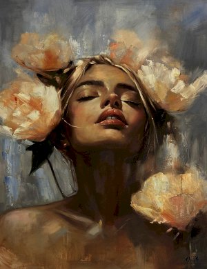
Balance: It refers to the visual weight of the elements in a composition; it is necessary to ensure viewers do not feel discomfort in the arrangement. It can be symmetrical, with elements arranged as mirror images or on the two sides of a face, or asymmetrical, with the composition balanced through contrast between elements.
For example, the use of a small square in the centre of a large circle on the outer side balances the shapes. The design can be a radial composition where elements are equally spaced from a central point, like the spokes of a wheel, converging at a focal point.
Emphasis – Emphasis is the area of composition that is visually dominant and draws viewers' attention, often achieved through colour, shape, or contrast.
Proportion/scale: It creates a difference between the elements of a composition, where each element is highlighted in relation to the others and placed next to each other to create comparison. The area draws viewers' eyes to the focal point, creating contrast through the juxtaposition of elements of art.
The examples of proportion or scale include the classical Greek statue Doryphoros by Polykleitos (c. 450 BCE), which uses specific mathematical ratios to define the ideal human form. Negative and positive space, or contemporary colours, is one of the famous scales used in Japanese design concepts, Notan.
Movement- A sense of movement is created in a work of art where the viewer’s eye go around and within an image, it is sometimes created by using diagonal or curvy lines, by edges, or real or implied lies or by creating an illusion of space, repetition and energetic mark making are used to create movement.
Pattern – A pattern is created by the repetition of elements of art or by using a combination of elements of art. It can be anything turned into a pattern through repetition of spirals, grids or weaves. One of the famous designs used is Zentangles, an abstract representation of an outline that can be divided into different areas, each containing a unique pattern.
Unity – It unifies all elements to fit within the frame. Too much unity leads to monotony, and too much variety can cause confusion and chaos. The artist must know how to use them to create interesting work in which the audience views something in harmony, or to use elements to create contrast and emphasise a cohesive, engaging composition.
Importance of the principle of design in art – The 7 Principles of art are important because they help us understand the elements, explain what an artist has produced, and convey what is going on in a specific story. It helps to gain insights by utilising the common language shared by the art, the artist, and the audience.
The elements and principles of design are part of the most powerful works because they help viewers familiarise themselves with the work and make them more aware of the details depicted, allowing them to better appreciate the message behind it.
Connecting with art requires empathetic or inquisitive attention, and a successful painting is unified while also offering variety through areas of contrast and emphasis, is visually balanced, and moves the viewer’s eye around the composition. Thus, it is one principle of art that can influence the effect and impact of another.
What Are the Principles of Art? (Principles of Art Definition)
Principles of art definition: The 7 principles of art are rules for combining 7 elements to create unique artistic compositions. There are seven primary principles of art that artists use to create balanced and consequential artistry, including balance, emphasis, movement, proportion, rhythm, unity, and variety. (Some resources mention eight principles of design.)
Why Are the Principles of Art Important?
The artist uses the principles of art to organise the elements in the artwork to convey what the artist intends and to create an effect on the viewer, which is important for determining whether the painting is successful.
- The principles are intertwined and depend on other principles to deliver a visually balanced work that appears right and stable.
- Artists use the 7 principles of art to manipulate, alter, and combine the elements, and employ the design principles to create a distinctive work of art.
- Not every artwork contains all components; it may include two or three. For instance, a 3D sculptor must have space, and a 2D artist must use ratio and contrast.
- Contrast, repetition, and Rhythm are employed to make the artworks shine and capture others' attention, while harmony, the direction of movement, and balance help make your design look more aesthetically appealing.
- It is believed that elements and principles of design are only applicable to objective artworks; even abstract art or optical illusions utilise two or more of these elements and principles of design catch the audience's attention, trigger emotions, and draw their deep attention to the art.
Elements of Art vs Principles of Art (Complete Comparison)
The 7 Elements of Art are
Colour – It represents hue, saturation and value.
Form- It shows a 3D object, such as a cube or a square.
Line – It marks the length and direction.
Texture – It is the surface quality, which can be real or implied.
Space – It is the area around and between objects.
Shape – It is a 2D area, such as a triangle, a circle, or a square.
Value - It shows the darkness or the lightness of a colour or the tone.
The 7 principles of art are Rhythm, balance, emphasis, proportion, gradation, movement, harmony (unity), and variety.
The 7 Principles of Art Explained with Examples
Rhythm – The principles of Rhythm depict movement and repeated elements that cause a flow or beat.
Balance – Elements can be combined in a specific manner to create a feeling of equilibrium and harmony. The common types of balance are symmetrical, asymmetrical and radial.
Proportion – It is the design principle which highlights the difference or relationship between objects.
Emphasis – It draws attention to the focal point or a specific area, highlighting certain differences among the elements.
Movement – It is the design principle that creates the feeling of action, guiding the viewer’s eye throughout the work of art.
Unity – It provides a way to combine similar elements to create wholeness. It can be used repeatedly with subtle, gradual changes, and sometimes to increase similarities and create a pattern.
Variety- It is the principle that brings diversity, and it can be achieved through colours, shapes, sizes, and patterns.
Some references use Contrast instead of Proportion/Ratio to depict the difference, and Gradation, which uses a series of gradual changes in elements from large to small shapes and from dark to light hues.
Principles of Art with Real-Life Examples
The 7 principles of art with real-life examples
Balance – The mirrored, symmetrical, and unevenly distributed visual weight is evident in many famous paintings. The mirrored composition is part of Da Vinci's paintings, the Mona Lisa and The Last Supper, where Da Vinci suggested placing a mirror next to the object being painted to compare the reflection with the painting, checking if the composition corresponded to the natural world, and later Renaissance artists experimented with perspective and illusions, such as anamorphic, or distorted, images.
Emphasis – A focal point is created using contrasts or colour, such as black in a light colour painting or a red subject in a muted work. For example, Leonardo da Vinci's "The Last Supper" focuses on Jesus and uses architectural lines that converge on him. At the same time, Edward Hopper's "Nighthawks" isolates a figure to draw attention to loneliness.
Movement- Movement creates visual flow, suggesting motion. Sometimes, diagonal lines are used to depict movement. Movement is achieved through dynamic compositions, brushwork, and a thematic focus on action, ranging from the dramatic, swirling energy of Post-Impressionism to the speed-obsessed lines of Futurism to the kinetic, physical motion in sculpture.
For example, Baroque (c. 1600–1750) shows dramatic, diagonal compositions and intense emotion, such as Caravaggio’s The Calling of Saint Matthew. Futurism of the early 20th century emphasises speed, technology, and violence, exemplified by Umberto Boccioni’s sculpture Unique Forms of Continuity in Space (1913), and Abstract expressionism (1940s–50s) focuses on physical action, as in Jackson Pollock’s Convergence.
Proportion / Scale – Proportion depicts the size of elements and their role in the whole work or in comparison to other elements and principles of design. Example: The exaggeratedly long figures in a Giacometti sculpture, the mathematically precise human anatomy in Leonardo’s Vitruvian Man (proportion), and the hierarchical scale in the Palette of Narmer, where important figures are depicted larger, are some other examples of proportion.
Rhythm / Repetition – The repeated elements create a pattern, beat or tempo that feels musical. Andy Warhol’s mass-produced pop culture icons, which he used silkscreening to repeat, like Campbell's Soup Cans (1962) and Marilyn Monroe (1967), highlight mass consumption and industrial, mechanical production. The architectural arches of the Great Mosque of Cordoba and Islamic geometric designs are often based on repetition.
Unity/harmony – It creates a feeling of cohesion, with all elements combined to achieve balance and variety. A consistent colour palette is used to make the work appear complete. Examples include the balanced architectural Rhythm of the Parthenon (447 BC), the emotional colour harmony in Picasso’s "Boy with a Pipe" (1905), and the repetitive shapes in Van Gogh’s paintings.
Variety: Principles of design are used to create contrasting elements and to build visual interest, breaking up monotony. Such a composition includes vague geometric shapes with organic, flowing lines. Examples include Gustav Klimt’s Portrait of Adele Bloch-Bauer, famous for its geometric vs. organic patterns, and Van Gogh's Orchard in Blossom, which uses complementary colours.
Principles of Art for Beginners (Easy Explanation)
Beginners must know the rules for placing elements and the principles of design in their artwork to guide their work. The seven main principles of art for beginners guide new artists. It includes balance, emphasis, proportion, movement, pattern, rhythm/repetition, variety and unity.
To start, one must focus on the basic rule: balance, which gives the feeling of steadiness, and contrast, which helps make the object stand out.
Emphasis is used to create a central point where viewers are directed to look first, and other rules - patterns, Rhythm, and movement create a feeling of motion and action.
To avoid mistakes in elements and principles of design, the artist can create thumbnails, creating small compositions to test the balance of the final work. A basic composition can be used to identify the overall value and references that can be taken to create proportions. One can also limit the palette and start with certain basic colours to practice harmony and avoid chaos.
How to Use Principles of Art in Your Artwork
- To start, create patterns for elements and principles of design by repeating the shapes or forms with stencils or stamps.
- Build layers using dark and light colours next to each other.
- Establish a focal point with a bold shape or bright colour.
- Explore different rhythms by making lines or marks and creating shapes and movements that shift across the print, adding flow and keeping things full of life.
- Ensure the principles and elements of art are not used in excess; too much variety in colours, shapes or textures can lead to unclear messages, so it must be avoided.
- Also, the use of elements that appear independent or unconnected, or of non-rhythmic static layouts or floating colours, lines and shapes, can become boring and must be avoided.
Principles of Art in Different Art Forms
Principles of Art allow artists to manipulate the elements of art and convey the intended vision, which can be used in various art forms as given below –
Drawing and Paintings – It focuses on balance or compositional weight, emphasis on focal points, Rhythm, and the contrast of colour and value in 2D works.
Sculpture and architecture – They use balance for physical, long-lasting stability, space, form, and proportion to create a 3D narrative.
Graphic design/photography – Graphic design and photography rely on contrast, pattern, and repetition to direct viewers' attention towards a certain narrative.
Music, theatre, performance, and dance – these are about Rhythm, organised patterns, and actions. They require timing, unity, symmetry, and contrasting themes to get unique works.
Common Mistakes While Using Principles of Art
Common mistakes artists make when using the elements and principles of design include
Poor composition, ignoring the focal point, creating an unclear focal point, or multiple confusing focal points in a single work that the viewer may not notice.
Some works have heavy, dark, complex elements which are not clear, or they create an unbalanced layout where the subjects are in the centre or stagnant, or you find cluttered elements, weak contrast, overworked details, excess use of elements, confusing or uninteresting theme and poor usage of elements, which leads to flat designs.
Artworks sometimes ignore the Rule of Thirds, which is placing subjects in the front centre, creating an uninteresting composition, and some works allow shapes or lines in the background to intersect with the foreground, called “tangents”, which can create complexity and confusion.
Some paintings have a mid-tone range that makes them look flat, while others use black or white to create shadowy, unclear, and moody tones.
Poor proportions and abrupt forms that misuse space can lead to uninspiring compositions and undermine the believability of the idea of space.
FAQ Section
What Are the Principles of Art?
The 7 principles of art and design are balance, emphasis, movement, proportion, rhythm, unity and variety. Applying principles can help determine whether a painting is finished.
How Many Principles of Art Are There?
There are 7 principles of art used to organise the elements of art: balance, emphasis, movement, proportion, rhythm, unity and variety. Some sources expand the list to eight or more by including Contrast (scale relationship) and Harmony (cohesiveness).
What Is the Difference Between Elements and Principles of Art?
The elements of art are the basic building blocks that artists use in compositions, including line, colour, shape, and texture. In contrast, the 7 principles of art are guidelines for using and arranging design elements such as balance, proportion, rhythm, and emphasis to create an organised, meaningful composition.
Why Are Principles of Art Important?
The 7 principles of art are important because a person cannot make visual art without employing the elements and the rules for using them. Design principles are crucial tools that you must apply to improve the appearance of your artworks and make them more appealing to the eyes of those who view your art.
What Is Balance in Art?
The distribution of visual weight within a composition, where we arrange elements like colour, shape, and texture to create harmony or create a story, trigger emotions or intentional tension or a sense of equilibrium, to prevent one part of the artwork from feeling overwhelmingly heavier than another, is called the balance of art.
Visual balance is created through size, colour, texture, and contrast, and near-identical elements create symmetrical balance. Asymmetrical balance is achieved through dynamic, interesting, vivid compositions, and radial balance is created by establishing a focal point and a sense of unity.
The purpose of balance is to create an organised viewing experience. It applies to 2D art and photos, where the visual weight must be balanced, and, in the case of 3D art, such as sculpture and architecture, both visual and physical stability are assessed.
What Are Principles of Art Examples?
Key examples include
Balance for visual weight –
• Symmetrical balance, American Cutout of Animals, second quarter 19th century,
• Asymmetrical balance James Abbott McNeill Whistler, Arrangement in Grey and Black No.1, 1871,
• Radial balance(England, Charger of Charles II in the Boscobel Oak, c. 1685,
Emphasis for focal points) –
• Francisco Goya, The Third of May 1808, 1814,
Movement for guiding the eye –
• Hokusai, Ejiri in Suruga Province, 1830,
Rhythm/Pattern for repetition –
• Tughra (Official Signature) of Sultan Süleiman the Magnificent (r. 1520–66)
• Piet Mondrian, Broadway Boogie-Woogie, (1942-43).
Proportion/Scale for size relationships –
• María Izquierdo, The Indifferent Child, 1947,
• Ben Shahn, We French Workers Warn You..Defeat Means Slavery, Starvation, Death, 1942.
Unity/Harmony for cohesion –
• Fernando Botero, The Musicians, 1991.
Variety in principles of design is used for opposite elements -
• Caravaggio, Crucifixion of St. Peter, 1601
• Käthe Kollwitz, Misery, 1897.
Are Principles Of Art Important for Beginners?
Yes, the 7 principles of art are crucial for beginners because they provide a structured approach and a foundational framework for understanding how to arrange, compose, and make artistic decisions. It acts as "rules" for organising elements (like line, shape, colour) that help create more effective, intentional, and visually appealing artwork, and applies to all media: painting, design, digital design, music, sculpture, and other artworks.