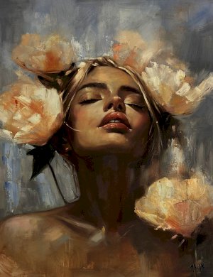

Harmony in Art is the principle that describes how well all the visual elements, such as colour, shapes, and textures, work together to create a visually cohesive, unified, and balanced composition. Harmony brings diverse components together to create a sense of order and cohesiveness. For instance, similar shapes, consistent textures and limited colour palettes are used to create harmony in art.
Colour harmony is created by using a restricted palette of analogous colours, which can be complementary colours that work together. Shapes or contours are repeated in an artwork to create visual consistency, or uniformity in texture or pattern is created by using brushstrokes on the canvas.
Harmony in Art – Meaning, Principles, and Powerful Examples in Visual Design
Harmony is the principle of Art that creates completeness by stressing the similarities of the separate but related parts. Harmony is not the same as unity; rather, it enhances unity. It uses elements of Art that are colour, line, value, space, texture, and form as a vehicle to create togetherness in separate parts.
- The synchrony or patterns in arranging visual elements like colour, shape, texture, line, and other elements, when complemented and enhanced, create a balance and consistency into a cohesive whole alongside variety, creating interest without disorder.
- Colour harmony refers to a scheme that creates harmony and cohesion; in art, this can be achieved by using colours related on the colour wheel, such as shades of a single hue or analogous colours, which create a unified feel.
- Repetitive elements, such as shapes, lines, or motifs, throughout a composition establish a visual rhythm and a sense of connection.
- Certain mathematical systems, such as the golden ratio, can create harmonious proportions in layout and element scaling, and similar shapes, such as geometric forms, can bring components of a piece together.
- Some examples of harmony in principles of art include Pablo Picasso's The Old Guitarist (1904), which shows harmony in colour, and Claude Monet's Water Lilies (1916), which depicts a logical progression and a relationship. Van Gogh's "The Starry Night" uses a consistent rhythmic, thick brushstroke to create a cohesive, energetic feel.
- Paul Cézanne, Mont Sainte-Victoire (1904-1906), depicts harmony in shape.
- Vincent van Gogh's Olive Trees Under a Yellow Sky and the November Sun (1889) show harmony in style.
Many other artists have used harmony in art in different styles, such as Piet Mondrian's Composition with Red, Yellow, and Blue (1942), which uses strictly geometric harmony, with repeated, balanced squares and lines. Hokusai's "The Great Wave off Kanagawa"(1831) shows repeated, fluid, and curved lines, and René Magritte’s Golconda creates harmony through the repetitive, orderly placement of small, similar figures (men in bowler hats) against a structured, muted colour palette.
What Is Harmony in Art?
Harmony in principles of art refers to the well-balanced arrangement of elements that creates a symmetrical, harmonious composition. Harmony is a principle that creates cohesiveness through similar and related parts. It uses colour, shape, value, form, space and texture to create a sense of togetherness with otherwise separate parts.
Harmony definition in art - Harmony in principles of art refers to the pleasing arrangement of visual elements, in which each contributes to a unified whole. It is visually satisfying to see related elements within a composition. The work of Art is considered harmonious when it is based on repeated contrasting elements, such as a related colour scheme with different shapes.
Elements of Art That Create Harmony
Art is based on realism, and its forms can be two- or three-dimensional. It is specifically concerned with how the formal elements of Art are in use. The elements that create harmony in art are –
Colour and value – One can use analogous colour, monochromatic schemes or a limited colour palette to create a sense of harmony. Colour harmony can be created using the 60-30-10 rule, which balances the dominant, secondary, and adjacent colours.
Harmony tends to use complementary colours, which create contrast. In Claude Monet: Stacks of Wheat, Monet used mainly midtones, without any bright highlights or dark shadows, to bring harmony to the piece.
Shape and form - Shape will follow a similar idea. It can be rounder or softer with greater aesthetic appeal. Gustav Klimt used patterns of geometric shapes on the dress in ‘The Kiss’, where the shapes complement one another; however, the elements harmonise due to the limited colour range typical of the style.
Line and Texture – The line is the most basic element which is used in the creation of all objects and shapes. A line can be used to create rhythm, to repeat patterns, and to add harmony. In “Olive Trees with yellow sky and sun” by Van Gogh, the texture harmony, in which one uses consistent ratios of similar or related textures throughout the painting, is evident.
From the trees to the yellow sky, the brushstrokes are in unison. Vincent Van Gogh used the impasto technique to create a sense of texture harmony in his work.
Consistent uniform brushstrokes, texture, style, or techniques throughout a piece create harmony.
In Van Gogh’s brushstroke techniques, lines are more than outlines; they create textures and define space, bringing his subjects to life in a harmonious dance of strokes. While other factors create a balance, space creates harmony, where a negative space holds a relational balance.
Principles of Design That Support Harmony in Art
The purpose of harmony in principles of art is to ensure balance, proportion, and the representation of the design. Harmonious work must include the principles of unity, balance and other parts which are interlinked. In the process of creating a painting, diversity in art relates to the painting and its theme. One can easily spot and observe the symbolic representations and cultural expressions of art.
The principles of design that support harmony are
Repetition and pattern - Similar elements, shapes, colour, and lines throughout an artwork help connect the different parts, creating a sense of unity.
Colour – Specific colour schemes ensure colours blend well and avoid jarring visual conflicts.
Similar shapes and lines – One can choose a component with a related colour or form to unify a composition. For instance, Yellow undertones are used to convey warmth and evoke emotions ranging from celebration to violence, and dark red, orange, and yellow colours trigger opposition, discomfort, and hunger. A line can create rhythm; if used in repeated patterns, it can add harmony by connecting how objects relate to one another.
Consistency in style and texture - Consistent brushstrokes and texture create a cohesive feel.
Balance and alignment – Elements can be arranged symmetrically or aligned to balance layouts to reduce visual tension, fostering a sense of order and harmony. Symmetry and asymmetry are both crucial for balance. Symmetry provides formality and a sense of stability, while asymmetry creates tension and interest. It distributes visual weight, for instance, in Monet’s The Promenade, the artist masterfully balances colour and light.
Proximity and arrangement – One can place objects near each other and organise them in a structured manner to make it appear harmonious.
Emphasis and variety – To emphasise, contrast can be used, and it creates a focal point, a centre of interest to anchor the piece. Van Gogh’s bold strokes show how varied textures and patterns maintain interest. Seurat’s pointillism techniques diversify without losing cohesion.
Scale – A principle like scale in art also affects harmony.
Types of Harmony in Art
Some examples of types of Harmony in Art are mentioned here.
Colour- Use of limited or similar palettes, such as analogous, monochrome, or complementary colours, balances visual weight for colour harmony.
Shape and form – Repeating shapes, motifs and lines can create consistency.
Texture and Brushwork – Texture and brushwork create harmony through repetitive patterns.
Thematic or idea harmony- All elements in the artwork support a central idea.
Examples of Harmony in Famous Artworks
Some of the famous harmony in art examples is
Claude Monet's "Water Lilies, (1899) - It uses a limited colour palette of blues, purples and greens. It uses related colours to create a sense of unity within the painting.
Gustav Klimt's "The Kiss" (1908) – It creates a sense of unity through the use of similar values in the gold patterns and the skin tones.
Piet Mondrian's "Composition with Red, Yellow, and Blue"(1942)- It uses repeated geometric patterns and shapes to balance the arrangement of colour and create harmony.
Henri Matisse's "The Dream" (1940) – It is known for creating a sense of atmosphere and mood. The symmetrical arrangement of figures and objects in the painting creates a sense of calm and order, while the limited colour palette gives a warm, muted tone.
Van Gogh’s “Cypresses” (1889) is about the use of impasto; the thickly applied paint and curvy lines create an almost three-dimensional effect, and its texture adds a sense of cohesiveness to the painting.
How to Create Harmony in Art (Step-by-Step Guide for Beginners)
To use the harmony principle of design, you must aim to achieve balance, unity and coherence. Step-by-Step Guide for Beginners to create harmony in art -
Step 1: Use shapes and lines alongside other elements to create harmony in the overall composition. First, try to control unity, and then alter various elements in the work.
Step 2: Before starting the composition, plan a theme and message you want to display in the work. Choose a colour palette to highlight your message. Use colours that relate to other colours to create a harmonious or contrasting palette. For years, artists have been using complementary colours such as red and green, blue and orange, and yellow and violet on the colour wheel to evoke a certain mood and deliver a sharp message. Such a colour combination dramatically improves the work and adds interest.
Step 3: Try to create harmony in art, a balance among the chosen elements in your artwork. For instance, use elements such as shape, line, size, colour, and texture to draw attention to the artwork's central point.
Step 4: Create visual rhythm and repetition. Repeat elements in your composition using a variety of colours, shapes, or lines. It will create a sense of harmony.
Step 5: Add contrast to create unity. Contrast brings together different design elements to bring cohesiveness.
Harmony in Different Art Forms
Harmony can be seen in visual arts such as drawing and painting, where the use of a limited palette or complementary colours creates a harmonious, unified effect.
Harmony in music creates a soothing, pleasing sound.
In design and architecture, symmetrical balance created by builders leads to harmony. For instance, in the classical Roman or Greek building facade, structural harmony creates a sense of stability.
It can be seen in photography and film, which rely on consistent colour grading, framing, and lighting.
Harmony is part of fashion and textile collections.
Harmony vs Unity in Art – Key Differences Explained
Unity and harmony in art complement each other, but they differ from each other. Unity in Art refers to the consistent use of elements, as if an artwork were composed of warmer tones. In contrast, harmony refers to the use of elements that complement each other.
The main difference between unity and harmony in art is –
Unity is the state of being one and complete, whereas harmony is an arrangement of parts into a consistent style.
Unity is achieved through repetition, and the alignment of all elements into a central concept, and harmony in principles of art is attained by using a limited palette of shapes, colours, and textures, which creates a sense of belonging.
Unity makes the work organised, and it reduces chaos.
Why Harmony in Art Is Important for Viewers
Harmony is essential because it creates
A cohesive blend of separate elements, such as line, shape, and colour, that provides a cohesive artwork rather than a disjointed or disorganised work.
A harmonious work appears comfortable, rhythmic and aesthetically appealing.
The techniques guide viewers through the artwork, creating a deliberate visual journey.
It helps to convey the artist's story, message, and mood more clearly and powerfully, and creates a balance, a sense of equilibrium in the composition.
Common Mistakes That Break Harmony in Art
Common mistakes that break harmony in art examples -
Light and shadow - Ignoring the range of light and dark values can wash out the light, and failing to establish a clear, consistent light source can make the art feel flat.
Over detailing – The lack of simplification can lead to excess noise, preventing viewers from resting on a point and breaking the unity.
Improper use of colours – Excessively vibrant colours or chaotic images can cause significant distraction.
Improper proportion – Unbalanced composition and improper proportion can lead to distorted, disorganised work.
Disparate elements – Mixing too many disparate elements, styles, themes, and techniques can lead to unprofessional work.
Unfinished works - Some paintings use too many colours that do not show how colours change in shadow, and some take longer to complete, lacking freshness and unity.
Tips to Improve Harmony in Your Artwork
To improve harmony in art examples -
- Ensure consistency in style and theme to manage synchronicity.
- Create large shapes before creating the details.
- Establish a focal point and a clear area of interest, and simplify the surroundings by reducing noise.
- Use a limited colour harmony with a set palette to ensure cohesion. Use a dominant colour in every paint, and mute complementary colours by adding an amount of the opposite colour.
- Organise the painting into logical value groups, such as dark, medium or light and repeat shapes or lines throughout the composition.
- Use a soft, blended edge to create continuity and flow, preventing jarring transitions.
- Pair complex, great detail areas with calmer areas to balance the visual weight.
Explain The Difference Between Proportion and Balance
Proportion is the relative size and scale of elements relative to one another, ensuring elements are appropriately scaled, while balance refers to the distribution of visual weight. Proportion involves scale, ratios, and relative magnitude. Balance involves symmetry, asymmetry, or radial arrangements.
FAQ
Q1: What Is Harmony in Art in Simple Words?
Harmony in the principles of art creates cohesion by emphasising the similarities among separate but related parts. It is a method used for achieving the goal of unity that reduces noise and creates a pleasant, visually restful experience.
Q2: What Is the Difference Between Harmony and Unity in Art?
While often used interchangeably, harmony specifically refers to the use of similar elements to create a relationship. At the same time, unity is the principle of art that gives an artwork a feeling of “oneness”. Unity and harmony in art are similar, but unity is broader. Unity can be achieved through the consistent use of colour, texture, shape, and line and harmony can be achieved when elements within an artwork complement one another to strengthen others’ impact.
Q3: How Do Artists Create Harmony in Art?
Harmony in principles of art can be created through similar colours or shapes, but it can also be achieved through contrast. Artists create harmony by arranging colour, shape, line, and texture, fostering a sense of cohesion. The techniques artists use to create harmony in art include a consistent, limited colour palette, repeated textures and shapes, and balancing visual weight through symmetrical and asymmetrical compositions.
Q4: Why Is Harmony Important in Art?
Harmony in the principles of art is important because it brings together elements of colour, shape, form, and texture to create a balanced, engaging experience, presenting a unified, visually pleasurable composition that evokes a mood and guides the viewer’s eye, creating a gratifying arrangement that feels uncomplicated and comfortable to the eye.
Q5: What Are Examples of Harmony in Art?
Some examples of harmony in Art are Vincent van Gogh's The Starry Night (it uses limited colors blues, yellow and purple), Claude Monet's Water Lilies (it employs greens, purples and blues to create cohesiveness), Gustav Klimt's The Kiss(it features repeated patterns of geometric shapes to complement each other) and Piet Mondrian's Composition with Red, Yellow, and Blue use repeated balanced geometric shapes.
Q6: Is Harmony the Same as Balance in Art?
No, harmony and balance are not the same in art, but they are related principles of design. Balance focuses on the weight of elements, while harmony focuses on how the elements are related and complement each other to create an agreeable arrangement of elements.
Q7: Can There Be Too Much Harmony in Art?
Yes, too much harmony in art can be boring, unengaging, and monotonous. While harmony creates unity and cohesion, overdoing it removes necessary contrast. An excess of harmony means all elements fail to grab the viewer's attention, while too much variety can cause chaos.
Q8: What Are the Main Techniques to Create Harmony in Art?
Harmony in art can be achieved by combining colour, shape, texture, and line to create a repeating, similar, or analogous design or motif that establishes a consistent value and balances compositions through symmetry. Similar brushwork or texture in harmony prevents visual contrast and allows colour to blend seamlessly.
Q9: Can Harmony in Art Be Achieved Without Using Many Colours?
Harmony in principles of art is achieved through monochromatic schemes, in which artists use variations of a single hue, limited palettes, or analogous colours. Limiting colours increases coherence, and focusing on value, tones, and texture ensures visual interest. Instead of relying on hues, light and dark shades, or focusing on a narrow range of tones, a broader range of tones can be applied.
Q10: Does Harmony Apply to All Art Forms?
Yes, the harmony principle of design is fundamental to all art forms, including painting, music, sculpture, architecture, and poetry. It creates a balance and visual or auditory unity. It involves arranging elements—such as colours, shapes, or sounds—to work together, preventing chaotic, boring, or disjointed compositions.