


Positive and negative space refer to a composition in art, photography, and graphic design in which the positive space is the subject or areas of interest, and the negative space is the space around the focal point. Negative space may not necessarily mean white or empty; it is the space that supports the painting's subject.
Positive space is created by the elements in the foreground, and negative space is the background. An artist must maintain a balance between positive and negative when creating logo design, web design, and typography. The interplay between the two ignites visual interest, a key element of a good composition.
Positive and Negative Space in Art and Design (Complete
Guide)
Every work, whether it is a painting, a cinematic short, a photograph, or a sculpture, engages with space, and the role of the artist is to portray that space as either positive or negative. The artist can fill the frame with different subjects, and positive space is the area which appears busy and detailed.
Positive and negative space art are two sides of the same coin, and they work in unison; while one may not affect the other, they give the work new meaning when they work together. Positive space is the main area of interest, and negative space is the empty, or background area. Often, negative space is the area around and between the subjects of an image.
Negative space can be an actual shape that shares edges with the positive shape, and it is just as important as the object itself. Negative spaces allow the viewer to see the work differently and abstractly. At times, it is understood only by a few people. The balance between the two highlights the composition's purpose.
It can be used to show chaos, portray a busy scene, or create a highly detailed image. Such a composition can be created as a single large object designed to draw attention, or as multiple smaller ones, highlighted in colour that blurs the surrounding negative space.
One interesting aspect of positive and negative space is that they can exchange places. A balanced positive and negative space art uses each to equal degrees. One can associate with symmetrical artworks, yet one must underline that symmetry is not necessary to create balance, as balance can be achieved through proportions.
What is Positive and Negative Space?
There are three types of compositions – positive-space-dominated, negative–space–dominated, and balanced compositions. The positive and negative elements create a sense of rhythm and movement, generating repetition and patterns, and alternating spaces help the viewer’s eye shift across the piece.
Positive space creates dominant visuals that immediately grab attention. It is the areas which immediately catch the eye. It can be a central shape, an illustrated character, or bold typography that is part of the image. It is used to create branding in which the logo or symbol is explicit and recognisable, and to establish a sense of weight, authority and presence in the design.
Negative space is used to depict hidden images and add depth and meaning to the design. Eliminating unnecessary background creates substantial negative space. An empty background allows the main subject to stand out, making the design more apparent and impactful.
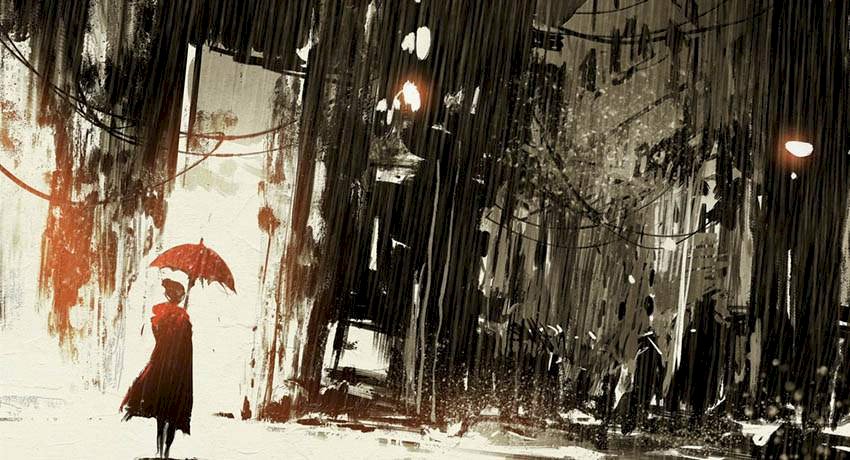
Allowing a huge portion of the frame for negative space provides an effective way to capture scale. The size of the negative space compared to the size of the character determines the colossal scale of the environment.
Negative space balances the positive space, preventing the visual piece from overwhelming viewers. The positive space is where action takes place, and the negative space is sometimes silent or the hidden area. The use of negative space helps draw attention to the work's central point.
A work with a high amount of negative space is simpler to understand and appreciate, so it is sometimes preferred to create a less busy work. When creating a three-dimensional drawing or painting on a two-dimensional surface, the negative space around the main subject adds dimension and makes it appear distinct.
Explain The Difference Between Positive Space and Negative Space
The difference between the two types of spaces has a huge impact on visual design, art, and architecture, with one really working and the other average.
- Positive space refers to the design’s primary subjects or elements. The key elements in a positive space are
- Focal point, which is the main subject or object that draws attention.
- The defined shapes that create the recognisable image, and the colour and texture, which are often filled with bold colours or intricate details to enhance visibility.
- Negative space is the area surrounding the main elements. A negative space reduces visual noise.
Importance of Positive and Negative Space in Art
There are many benefits of using negative space in an artwork. Negative space creates a clever, multi-layered design that can have hidden meanings. It has minimalist branding that allows simplicity to create impact and directs the viewer's eye through the composition.
The reasons for creating positive and negative space art include
- The spaces create a visual sense of rhythm, as in Claude Monet's painting Poplars on the Bank of the Epte (1892). The negative space of the sky sways the positive space of the trees.
- The work subtly communicates additional messages within the design when negative space is used.
- The space guides the viewer’s eye to the work's most significant elements, creating a clear, uncluttered focal point.
- Aesthetically proportioned positive and negative space art gives your composition a classy look, often associated with luxury branding. The space prevents the design from becoming cramped, allowing the user to read information efficiently and enhancing visual communication.
- Also, the spaces can be used strategically to hide symbols, meanings, and purpose in logos or illustrations, adding a layer of meaning to the work.
Examples of Positive and Negative Space
One of the most common examples of positive and negative space art is seeing a person’s face or a vase of flowers or a figure in a still life painting or trees in a landscape painting or a white vase (positive space) against a black background (negative space) or two black faces in a positive area where the white area acts as a background.
Some examples of positive and negative space are listed here.
- In Jacques-Louis David's 1787 painting The Death of Socrates, both spaces are roughly used in equal proportions. In the work, Socrates is sentenced to death by drinking hemlock, with the positive space boasting immense detail and various points of interest, and the negative space drawing attention to the subjects, creating a balance in the frame.
- The optical illusion, Rubin's Vase (1915), created by the psychologist Edgar Rubin, shows different aspects of the same design, and sometimes people may not agree on the image's subject. In the Rubin’s Vase, some people see the white area as the vase, and those who see the black area see two faces.
- The black-and-white woodcut print Sky and Water (1938) by M. C. Escher creates a rhythmic effect that demonstrates the interplay between positive and negative shapes. At the top of the painting are blackbirds. Positive shapes are set on a white background, and the eye moves across to where one can see the black elements, which become negative space. The white background changes into a fish shape, and depending on what you focus on, you see a bird or a fish in the centre.
- The famous Yin and Yang symbol shows a balance between negative and positive space and vice versa. It is an example of Notan, a Japanese design concept that represents a balance between positive and negative.
- The Still Life with Apples on a Sideboard (1900–19 6) by Paul Cézanne shows that positive and negative space art does not have black or white. In the painting, the bottles, the paint, and the milk jug create positive space and area around the object - the table and walls, which are in yellow, allowing the viewers to focus on the subject.
- A fiat ad shows a white letter on a black background, with the letter’s shape formed by a small illustration of a child, dog, or bus.
How Artists Use Positive and Negative Space
The exchange of positive and negative shapes creates harmony, rhythm, and distinction in the composition. Thoughtful use of negative space can create dynamism, movement, and unification, whereas the distinction between positive and negative shapes shifts creates dual images that can lead to optical illusions.
One must not try to manipulate the positive shapes to create such spaces; rather, the empty spaces must appear right in terms of placement, value, shape, and edges. A balanced composition uses both positive and negative space art equally. Both work together to draw the viewer's eye to the work's most prominent element, which evokes emotion and prompts a response.
Artists use the positive and negative space in the following manner –
- They establish balance and composition, giving the subject some breathing room to prevent the space from being overwhelmed by distracting details.
- Positive and negative space art helps to transform a dull image into a lively composition.
- Negative space determines the boundaries of the positive space. It helps outline, shape, and define the subject.
- Artists such as M.C. Escher use the space to create dual-image puzzles, distinguishing between the positive and negative spaces that are interchangeable.
- A lot of negative space in an artwork conveys messages like isolation, silence, boredom, and loneliness, whereas crowded space shows intensity, chaos, and a lot of activity.
Famous Examples of Negative Space in Design
Some famous examples of negative space include the Apple logo, the FedEx Logo, the World Wildlife Fund (WWF) Logo, the Rubin’s Vase, the Beats by Dre Logo, the Formula 1 (F1) Logo, the Apple plus leaf logo, and the Hope for African Children Initiative logo.
- FedEx Logo, designed by Lindon Leader, has a white space between the "E" and the "x" that forms a perfect arrow, showing direction and symbolising speed.
- In the World Wildlife Fund (WWF) Logo, the conic panda is created by leaving a white space within the black shape that defines the animal.
- In the Rubin's Vase, the classical psychological illusion of negative space is perceived as either a white vase or two black faces that look at each other.
- The Beats by Dre Logo, enclosed in a circle, features a small "b" as the positive space, and the inner hole shows the person's head, making the logo look like a headphone.
- The Hope for African Children Initiative logo, with negative space outlining the African continent, reveals the continent's shape in both adult and child forms.
- The modern Formula 1 (F1) Logo features a sharp white "1" in the negative space between the red brushstroke and the black "F."
- The Apple plus leaf logo uses a minimalist silhouette as a positive shape. In contrast, the surrounding space and the bite create functional negative space, which ensures the fruit is identified as an apple and not a cherry.
How to Practice Positive and Negative Space Drawing
To practice positive and negative space drawing, the artist must start with –
A pencil can be used to sketch the background contours, creating a colouring-book-like outline of the space. One can simplify the background to ensure the main subject stands out, and then draw the proportions to compare the sizes of the negative and positive spaces.
Create complex shapes with subjects like leafy plants or trees, or start by drawing simple, similar objects.
One must identify the negative space and colour it. Use a black marker or a pen to fill in the “negative area” around the object, such as a chair or a houseplant, which forces you to focus on the shape of the space around the object rather than drawing the object itself.
One must draw a still-life scene by outlining the background rather than the foreground objects.
To do the half exercise, draw the subject, and then divide it. Fill the positive space on one side and fill in the negative space on the other to create interplay.
A photo can shift attention. Use a photo to draw some spaces between the objects. Draw the shape of the spaces between branches of a tree or items in a room. Trace the edges of the negative space and try to learn about the shape of the space around the object.
To improve positive and negative space drawing, do not outline first; instead, spend time carefully examining the negative spaces and understanding their shapes and forms.
How to Use Positive and Negative Space to Create Better Paintings
To use positive and negative space effectively, one must treat both equally to create balance, build shapes, and use contrast to guide the viewer's eye to certain details of the painting.
One must use the negative shape to achieve drawing accuracy and consider the shape and the subject to avoid proportion errors. Try improving the work by using a solid, dark silhouette against a light background. One must focus on outlining the space between objects, such as table or chair legs. Initially, sketch the composition solely from the shapes of the dark and light areas, and ignore the subject's details.
The use of positive and negative space art plays a key role in various illustrations, creating balance and focus while nurturing storytelling in unique ways. The editorial illustration simplifies complex ideas, and when used creatively, negative spaces enhance storytelling, making the image thought-provoking and engaging.
A balanced mix of positive and negative space art guides the reader’s eye from one panel to another, strategically creating distinct action sequences and enhancing dramatic pauses.
A balanced distance ensures silhouette, which is crucial for making characters recognisable.
How to Make More Beautiful Compositions With Positive and Negative Space
The best ways to create beautiful, positive, and negative space drawings are
- Do not fill every space; leaving more negative space ensures the subject gets more attention.
- Use contrast to experiment with black and white, separating the positive and negative areas to make the composition striking.
- One can improve the painting by focusing on the shapes around the objects and subjects, using negative space to establish balance and interlocking shapes to strengthen the composition. Interlinked spaces connect the subject to the background, which has similar values and colours, creating a cohesive, well-composed design.
- Train your eye to identify background shapes rather than space, and use detailed positive space with calm negative space to prevent overcrowding.
- Make sure the subject is lighter than the surrounding areas, where the difference in shade creates a distinction.
- Draw the subject and trace the negative shapes onto a separate sheet to highlight the background's structural significance.
- Cut the shape from black paper and arrange it on a white sheet to test various placements.
- Focus on outlining the object's surroundings rather than the object itself.
- Create rhythms that require you to create a busy and a quiet area, guiding the viewer's eye towards the work's essential subject.
- Use tools to experiment with framing, shift the subject to the edge, which can create movement and tension.
- Split the work into fifty-fifty or use uneven ratios to create interesting dynamic compositions.
FAQ
What Is Positive and Negative Space in Art?
Positive and negative space in art compositions serve as proportions that create a relationship between the areas the artist wants viewers to see and those they must avoid. Often, the Positive space holds attention, and the negative space balances it, creating harmony and meaning.
Why Is Negative Space Important in Design?
Negative space is crucial in any design because it reduces cognitive load and improves the readability of the work by over 20%. It balances visual weight to prevent chaos and enhance the subject's precision, and conveys the composition's purpose perfectly.
What Are Examples Of Negative Space?
The famous examples of negative space include The white arrow between the E and the X in the FedEx logotype, The logo for the Guild of Food Writers, The Testaments created by Noma Bar for Margaret Atwood's, The South African wildlife charity SANCCOB trademark and logo, Formula 1 logo designed by Carter Wong studio(that was in use from 1994 until 2017), Japanese ink paintings, and Barbara Hepworth’s sculptures.
How Do Beginners Practice Negative Space Drawing?
Beginners practice negative space drawing by first drawing the object, focusing on the shapes of the air or background, and then searching for enclosed gaps within the subject. One can add hidden messages to shapes, create optical illusions with shapes, and control viewers’ attention by incorporating messages and the right mood.
Is Negative Space Always Empty?
No, a negative space does not always mean a space. Negative space may remain unoccupied around the subject, but it may contain colours, patterns, textures, and even hidden messages and purposefully integrated shapes.
Is Positive Space White or Black?
A positive space is neither exclusively white nor exclusively black; it is a defined space or the main area of interest in an artwork. It often contrasts with a background that can be black, white, or any colour.
What Are Positive and Negative Shapes in Art?
Positive spaces and shapes refer to the solid objects or subjects that are the focus of an artwork. Positive and negative shapes refer to the flat design of an image, with the object's silhouette or boundary and its surrounding spaces. Negative shapes help the positive shape stand out, so the artist must use both to create clear, structured images which communicate powerfully.